
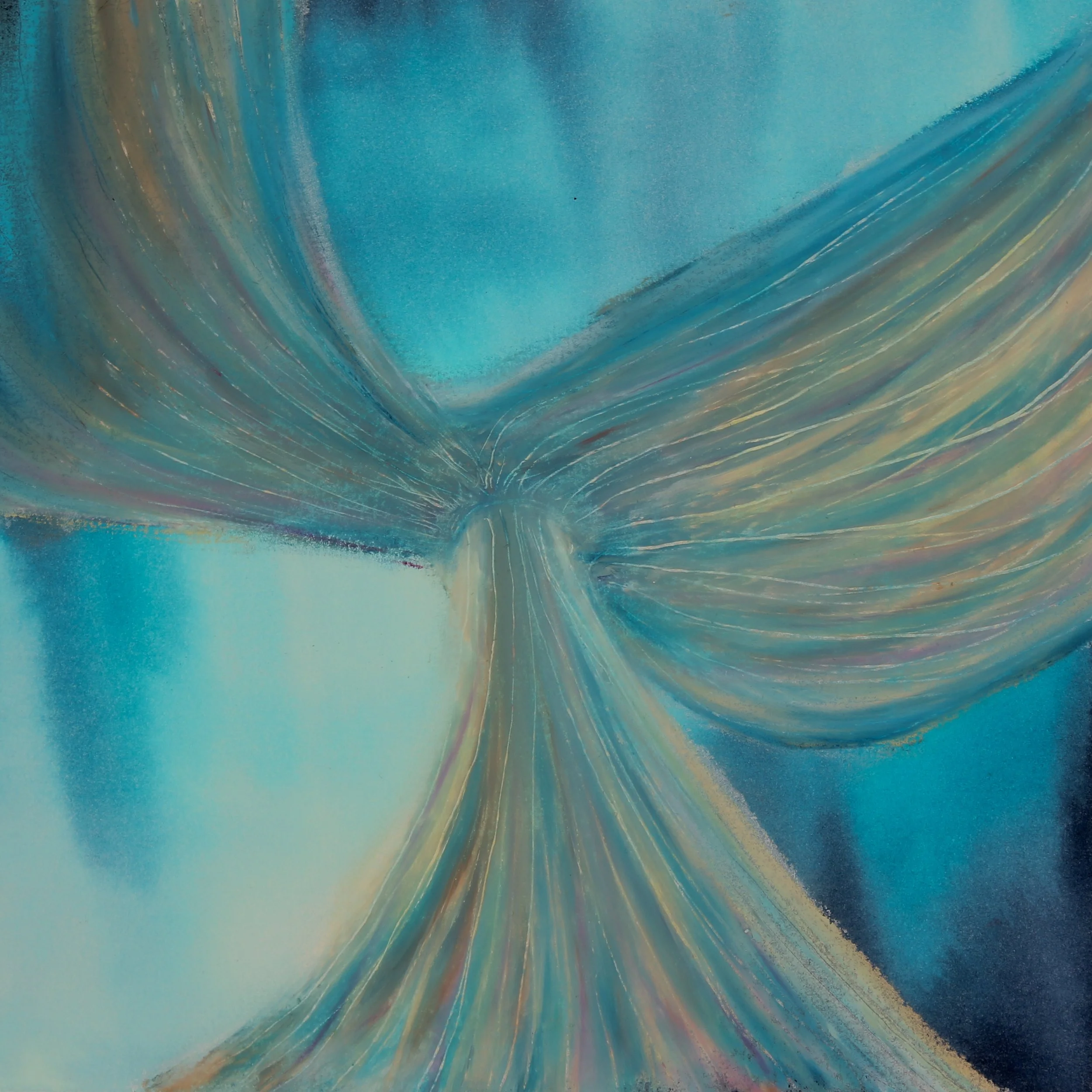
An Unfolding (2026) by Anna Volk. An exploration of luminosity and directional flow.
Each November, as the Northern Hemisphere starts running short on daylight, I find myself slowing to a snail's pace. It's a compounding sluggishness that makes inching through the dark winter months a total slog. And while I’m a notorious night owl who relishes the dark, during waking hours I require the sun.
After years of trying everything to combat these seasonal blues—from nature documentaries about Bali to morning Zumba—I finally bought a sun lamp. Since clicking purchase several days ago, I've been anxiously awaiting its arrival. But in the interim, I thought it would be an optimal time to focus on light in my daily art practice and explore the luminous work of other abstract artists.
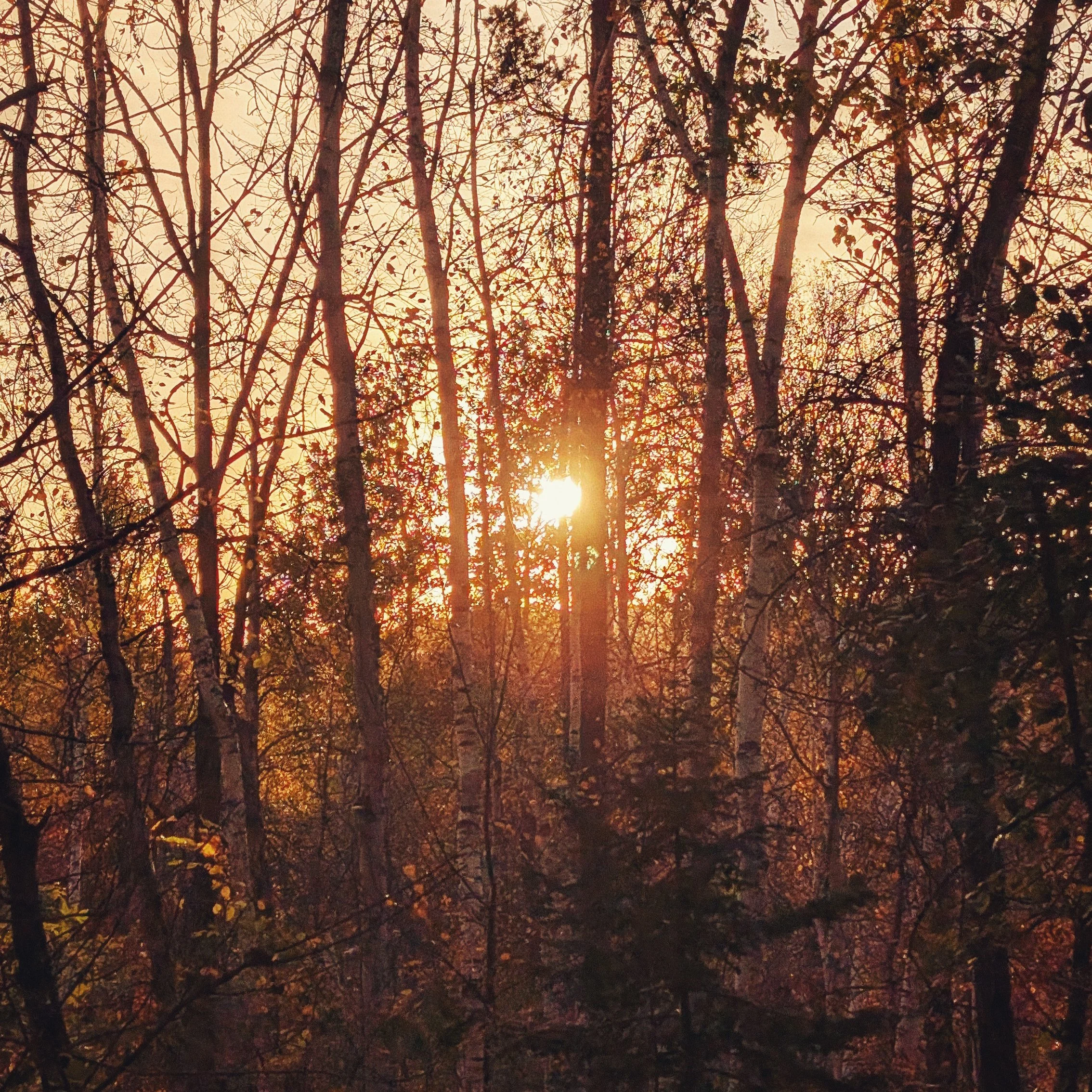
The golden hour glow outside my window that keeps drifting backward on the clock.
In abstract art, light can be an elusive concept to grasp, because you don't necessarily have a defined subject interacting with a light source. However, the basic dynamics of light—luminosity, contrast, and direction—can still be woven into an abstract style. Today, we're taking a closer look at these individual dynamics to see how they can be captured to create abstract artwork that truly lights up a room.
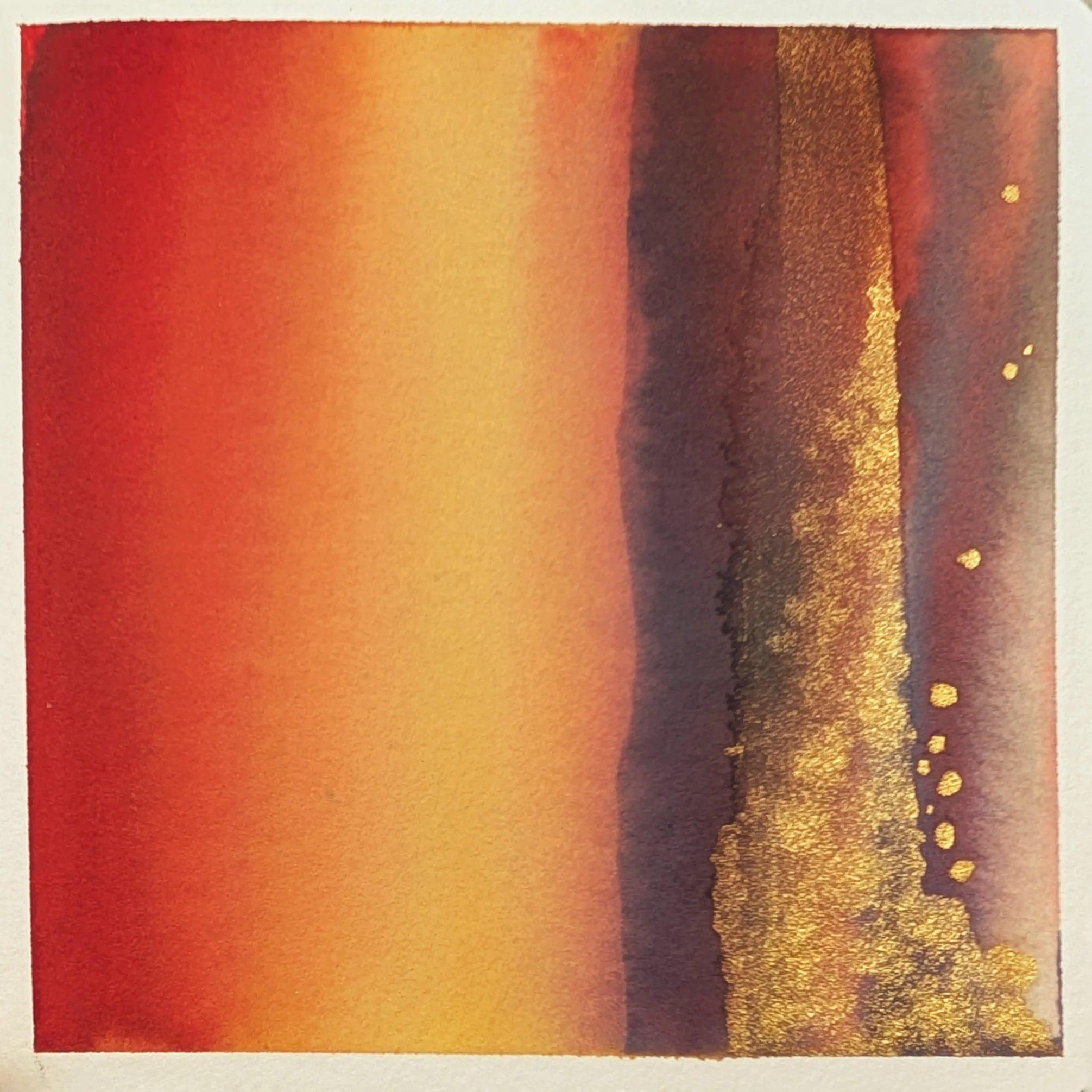
A recent abstract light study from my own journal, playing with thin watercolor glazes, contrast, and touches of gold.
Luminosity
Let's start with luminosity. Basically, luminosity is the lit-from-within look a piece has. The way an artist goes about creating this luminosity establishes the tone and atmosphere of a piece. On one end of the scale, it can make colors appear overwhelmingly loud and clear, like looking at a cloudless sky at high noon.
A perfect abstract example of this is the Mark Rothko color field painting below. The bright, bold expanses of yellow and orange feel alive not just because they're colorful, but because they are broadly luminous.
Rothko employed several different techniques to achieve this effect in his paintings, but most consistently he applied multiple, thin layers of various pigments (often using contrasting colors or variations on a single hue) to create an optical blending of colors. Looking at the painting, your eye pierces through all those layers, resulting in a color field that practically vibrates. The overall effect is a confronting wall of luminous color that tends to evoke a sense of the sublime. The sheer scale of his paintings also helped.
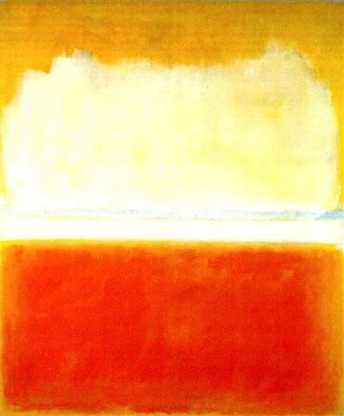
No. 8 (1952) by Mark Rothko. Image source: WikiArt.
On the opposite end, luminosity can show up as a contained glow that whispers through the dark. Hilma af Klint’s painting, The Dove, No. 3, demonstrates this beautifully.
Rather than working in uniform, expansive layers of color like Rothko, in this painting af Klint blends concentrated light values into surrounding dark values. She set light-colored forms against a stark black field, then blended the lighter colors outward to create a radiant halo effect in specific areas. Instead of a confronting color field, you get a striking flash of light that catches the eye.
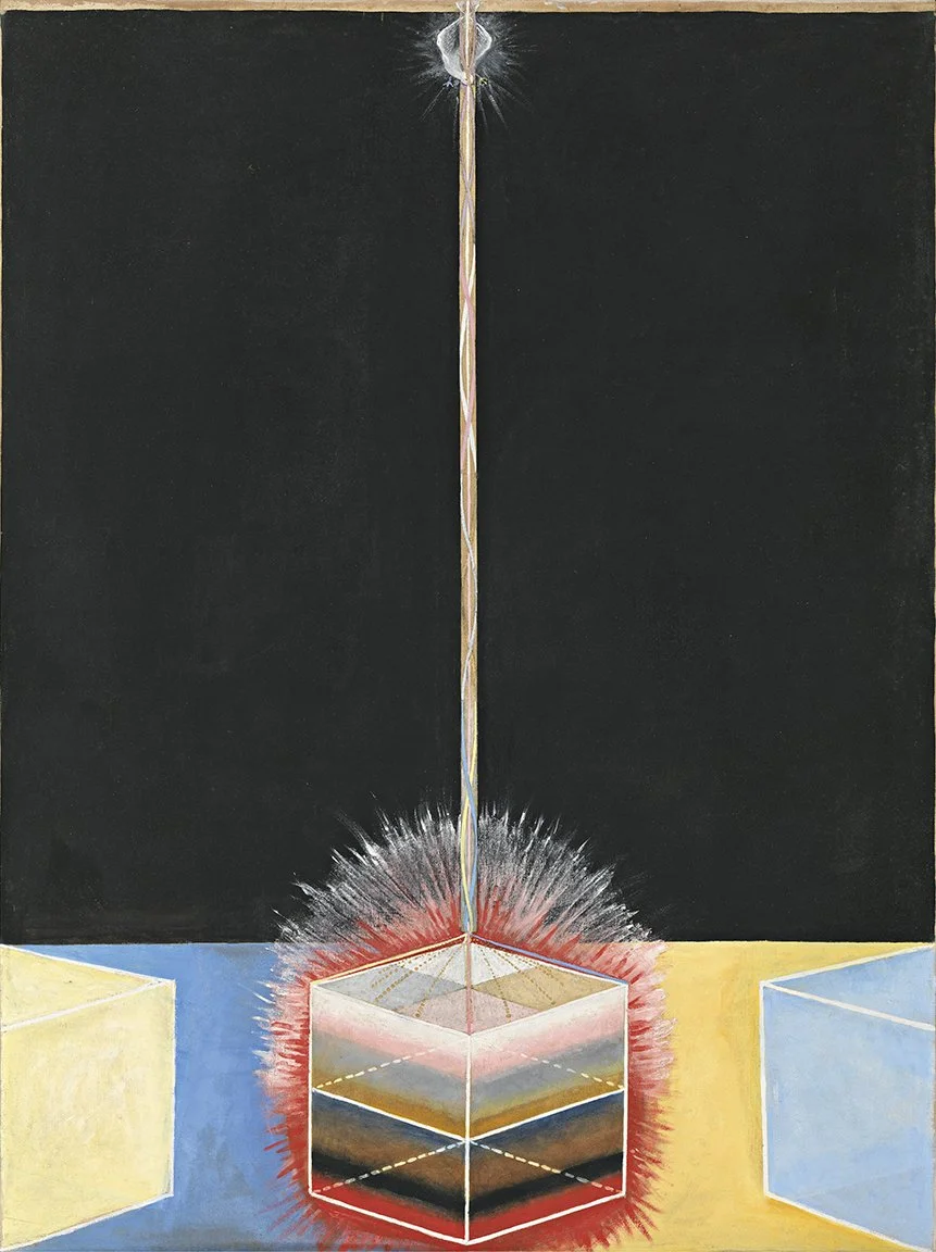
Group IX/UW, The Dove, No. 3 (1915) by Hilma af Klint. Image source: The Guggenheim Museum.
Contrast
Speaking of light and dark values, the next stop on our dynamic journey through light is contrast.
Contrast is simply the relationship between light and shadow. To the human eye, light can only ever seem as bright as a shadow is dark. So, the greater the degree of separation between your lightest value and your darkest value, the more contrast and drama you create.
Pierre Soulages, often referred to as “the painter of black,” was an absolute genius at leveraging contrast to create luminous drama on a canvas. His painting, Peinture 260 x 202 cm, 19 juin 1963, offers a stunning example.
The white background pulses through the heavy black brush strokes. On this canvas, white is pure light and the black is shadow incarnate. To create this effect, Soulages applied black paint to the canvas and spread it in swaths, reserving areas of white and allowing for different degrees of transparency. This makes the areas where white peeks through the black look reflective and alive.
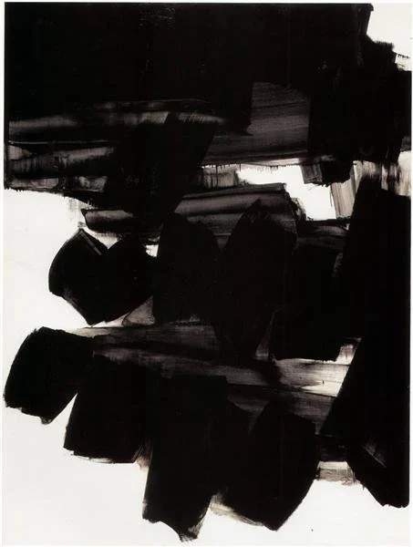
Peinture 260 x 202 cm, 19 juin 1963 by Pierre Soulages. Image source: WikiArt.
Now that we’ve seen the drama contrast can create, let’s take a look at the effect of bringing your light and dark values closer together on the scale.
While the drama of high-contrast light values can be compelling, low-contrast values can be just as enthralling. Agnes Pelton’s painting, The Fountains, is nothing short of mystical.
As you can see in the image below, both the light and dark values sit much closer to the middle of the scale. This allowed Pelton to delicately integrate light and shadow, creating an ethereal glow.
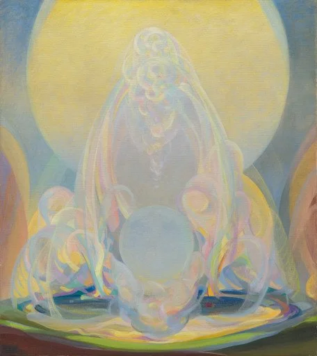
The Fountains (1926) by Agnes Pelton. Image source: The Museum of Modern Art (MoMA).
Direction
So far we’ve covered the ambiance of light through luminosity and the dynamic action between light and shadow on the canvas through contrast. Now let’s talk about direction. In realistic art, the direction of light refers to the physical angle at which a light source hits an object to create form and shadow.
In abstract art, which lacks literal objects and light sources, direction translates into visual flow—how an artist uses light to guide your eye through a composition. Of course, there are countless ways to do this, but let’s look at the two extreme ends: stillness vs. movement.
In Gerhard Richter’s Abstract Painting No. 599, the light doesn’t come to you; you go to the light. Light is used as a stationary focal point, a touchstone for your eyes that guides you through the painting.
In scanning the composition below, there are an assortment of intricately textured vertical bands of color. Naturally, you probably noticed that the central teal band has a streak of light at the base that draws the eye and veers off to a luminous area on the far left. I don’t know about you, but it makes me want to jump into the painting and race around that corner to meet the light source. That’s brilliant composition using light as a still focal point.
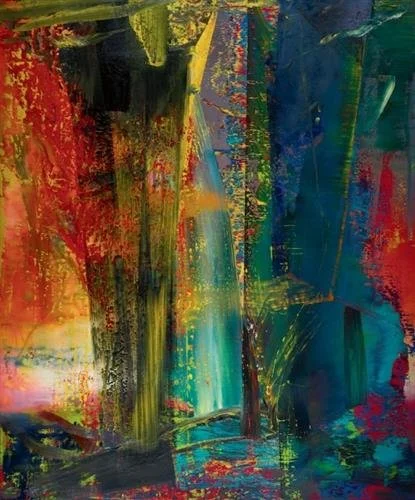
Abstract Painting No. 599 (1986) by Gerhard Richter. Image source: WikiArt.
On the opposite end, we have this turbulent painting by Alma Woodsey Thomas. Instead of using sparse areas of light to pull the viewer through the painting, Thomas’s The Stormy Sea presents many jumbled areas of light, encompassed by shadow.
There isn’t a specific point for the eye to land on, and that’s intentional. It’s meant to evoke the rapidly shifting rhythm of a stormy sea. I find that my eyes bounce between the light areas so quickly that the waves themselves seem to swirl around the canvas. It’s a wild ride and a masterful composition directed by light!
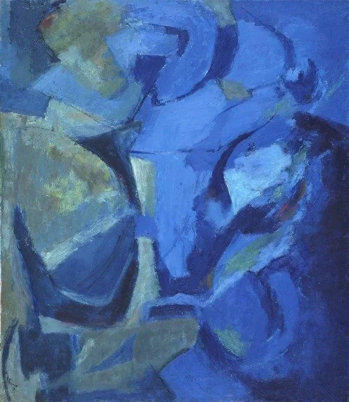
The Stormy Sea (1958) by Alma Woodsey Thomas. Image source: WikiArt.
What I find most fascinating about the study of light in abstract art is that it’s self-generating. Even without a light source, on the shortest days of the darkest season, you can illuminate a canvas with thoughtfully placed values and layers of color.
Studying the work of other artists is a fantastic way to invite more light into your practice, get inspired, and learn from the techniques they used! All that being said, I’ve gotta go. I just heard the doorbell, and I think it’s my sun lamp.
Let’s keep it glowing—which featured painting lit you up most? Leave a comment below! Thanks for reading!